In the ever-evolving realm of web design, a fundamental shift has taken place with the rise of mobile devices – the mobile-first approach. This design philosophy prioritizes the creation of a seamless and engaging user experience on smaller screens before expanding to larger ones. In this article, we will delve into the intricacies of the mobile-first approach, exploring its significance, best practices, and the impact it has on modern web design.

Introduction: Embracing Mobile-First Design
In a world dominated by smartphones and tablets, the mobile-first approach is not merely a trend; it is a necessity. This design strategy advocates for starting the design process by focusing on the constraints and opportunities presented by mobile devices.
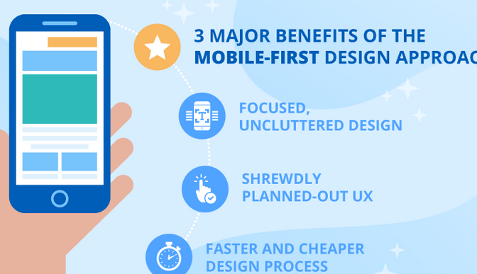
The Significance of Mobile-First Design
The mobile-first design addresses the shift in user behaviour, with more people accessing the internet through mobile devices than ever before. This approach acknowledges that a website’s primary audience may engage with it via a smartphone, and as such, the design should cater to their needs first. By putting mobile users at the forefront, designers can create a foundation that translates well to larger screens, ensuring a consistent brand experience across devices.
Best Practices for Mobile-First Design
Prioritize Content Hierarchy
Begin by identifying the essential content and features. This ensures that users on mobile devices get the most critical information without unnecessary clutter.
Responsive Design
Implement responsive design techniques to allow the website or application to adapt seamlessly to various screen sizes. This guarantees a smooth transition between mobile, tablet, and desktop experiences.
Performance Optimization
Mobile users often have limited bandwidth. Optimize images and code for faster loading times, enhancing the overall performance of the site on mobile devices.
Thumb-Friendly Navigation
Consider the ergonomics of mobile usage. Design navigation elements that are easily accessible and navigable with a thumb, keeping user convenience in mind.
Impact on Modern Web Design
The mobile-first approach has revolutionized the way designers conceptualize and execute their projects. It encourages a shift in mindset, focusing on simplicity, efficiency, and user-centricity. Additionally, Google’s mobile-first indexing, which prioritizes mobile content for search rankings, underscores the importance of adopting this approach.
Enhancing User Engagement
Mobile-first design fosters higher user engagement by emphasizing the most critical content and functionalities. This streamlined approach often results in a more engaging and user-friendly experience.
Accelerated Mobile Pages (AMP)
The mobile-first approach aligns seamlessly with initiatives like Accelerated Mobile Pages (AMP). AMP is an open-source framework that prioritizes speed and user experience on mobile devices. Designers adopting a mobile-first strategy find it easier to integrate AMP, thus delivering content at lightning speed and improving overall site performance.
SEO Benefits
Search engines, including Google, prioritize mobile-friendly websites in their rankings. Embracing a mobile-first design not only meets the expectations of users but also aligns with search engine algorithms, positively impacting a site’s search engine optimization (SEO). Higher visibility in search results can lead to increased traffic and improved online presence.
Challenges and Solutions in Mobile-First Design
Despite its advantages, the mobile-first approach comes with its set of challenges. One such challenge is adapting complex desktop layouts to smaller screens. Designers must carefully consider the essential elements while maintaining a clean and intuitive design. Progressive enhancement, starting with a simple mobile layout and progressively adding features for larger screens, is a viable solution.
Conclusion
As we navigate the digital landscape, the mobile-first approach stands as a beacon guiding designers toward creating inclusive and accessible digital experiences. With an increasing number of users relying on mobile devices, embracing this philosophy is not just an option but a strategic imperative. By prioritizing mobile users, designers set the stage for a responsive, user-friendly, and future-proof web presence. As technology continues to evolve, the mobile-first approach will undoubtedly remain a cornerstone in shaping the way we design and interact with the digital world.